OPEN
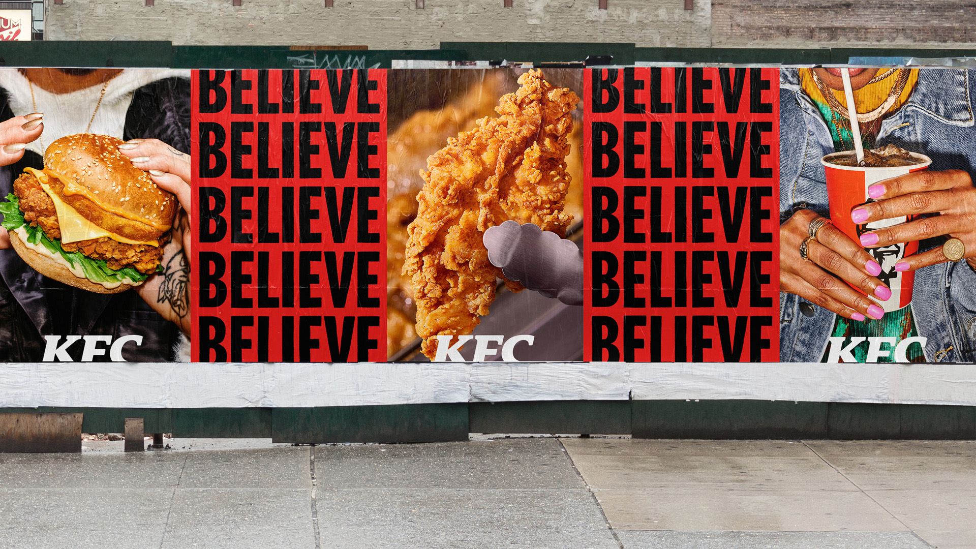
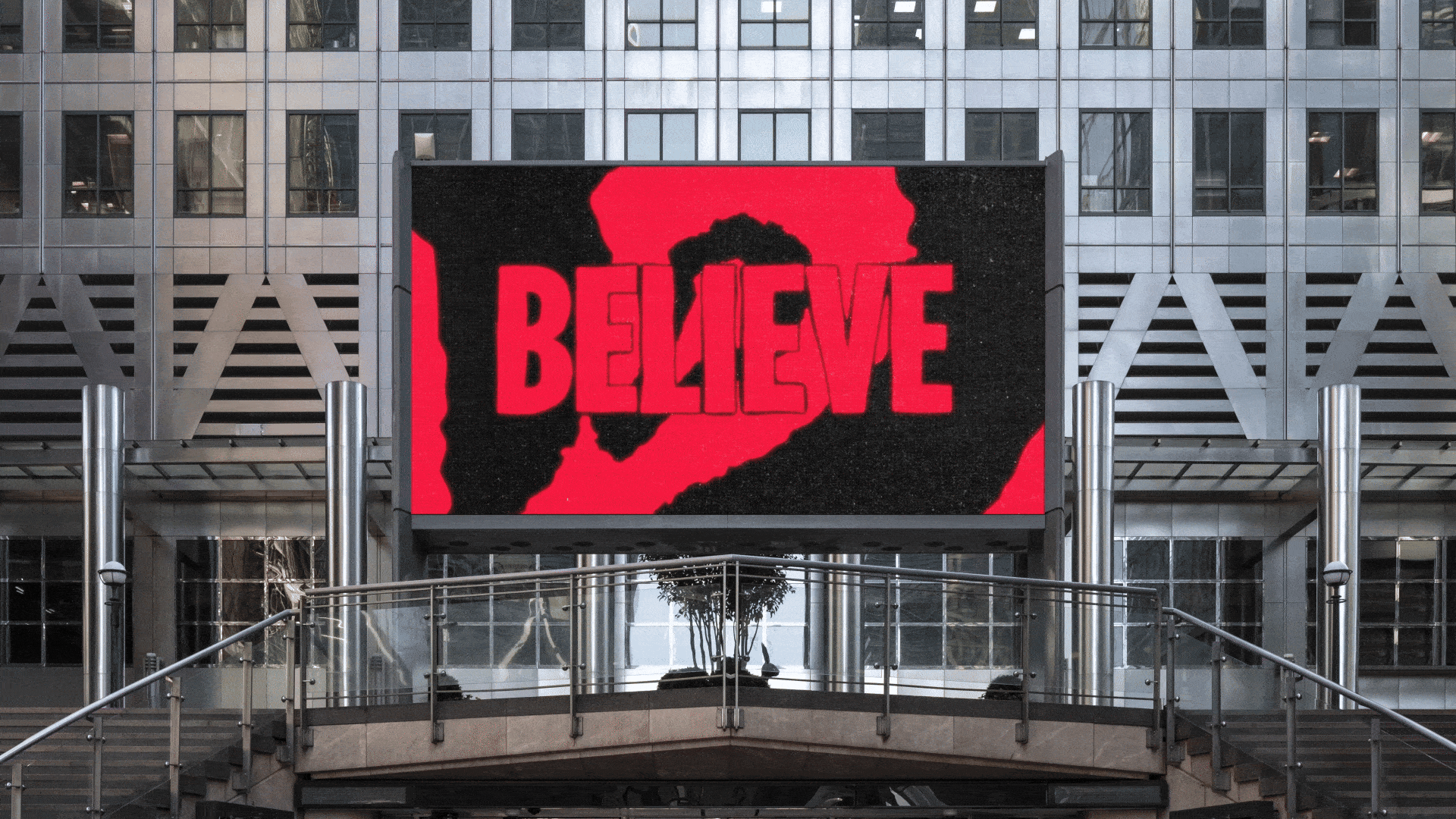
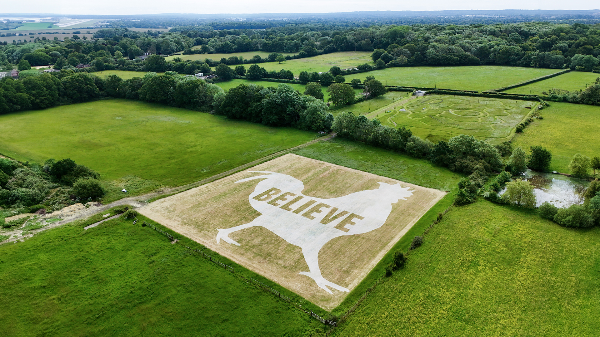
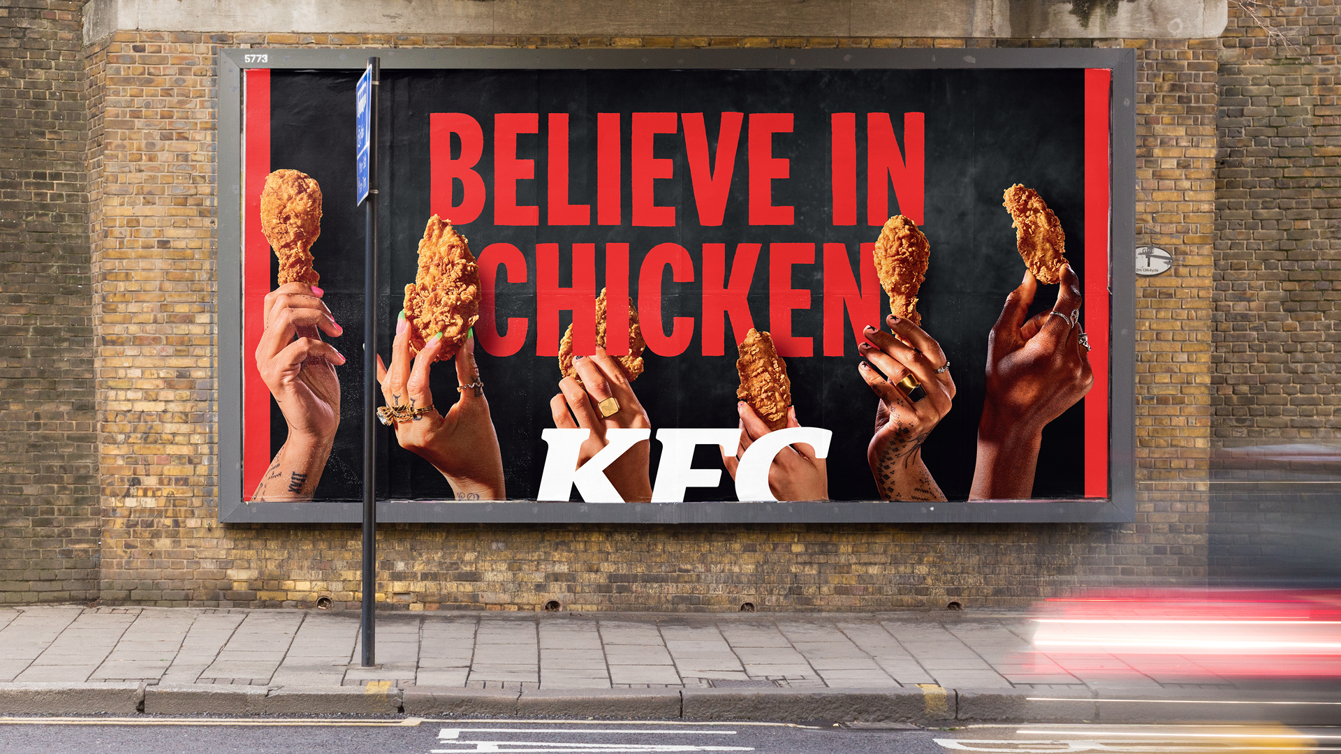
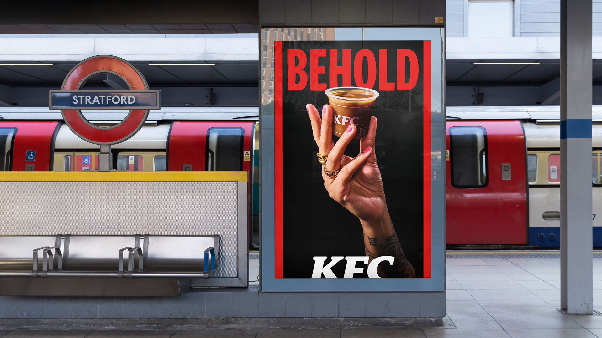
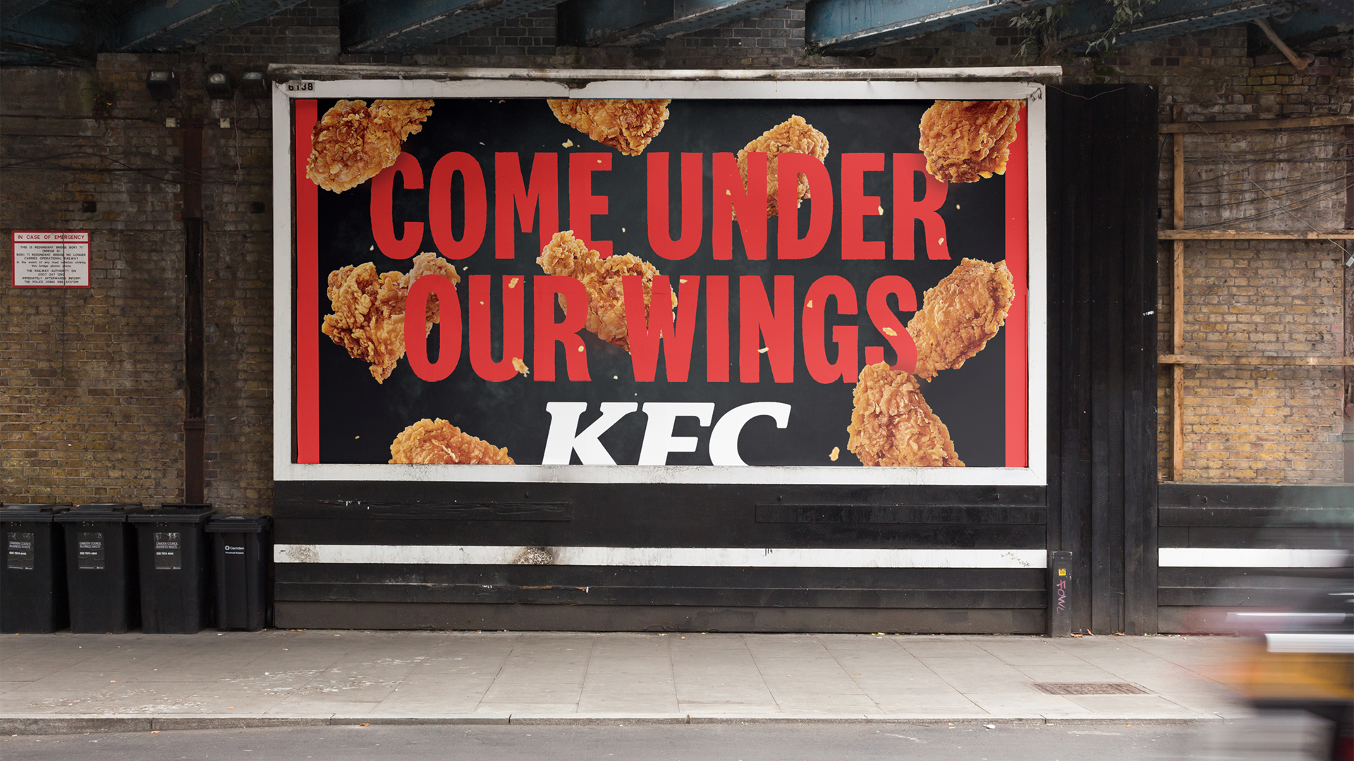
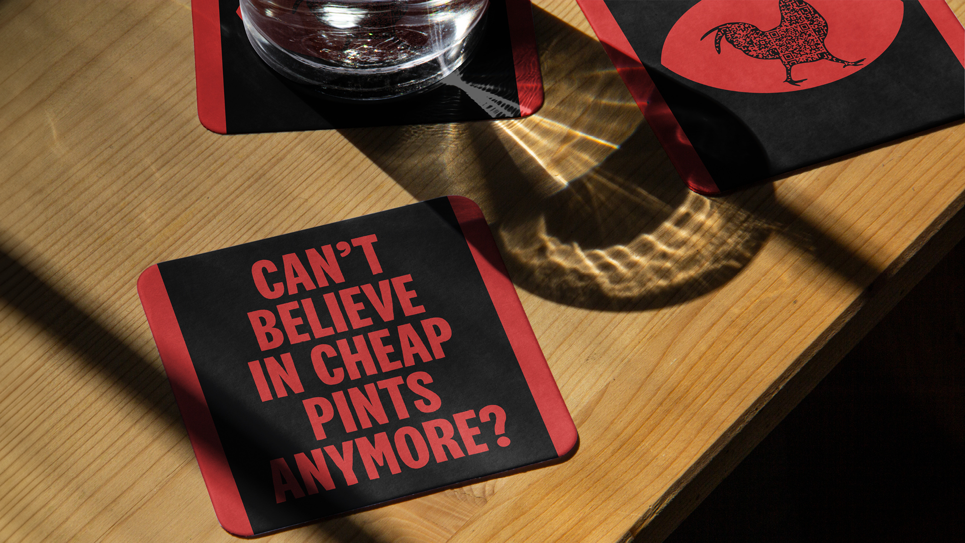
We partnered with Family Type to develop a variable display typeface for KFC’s Believe in Chicken campaign — built on the idea that no two pieces of chicken are ever the same. Reinterpreting KFC’s National Condensed Bold as a hand-drawn, highly flexible system, we introduced multiple compatible masters and algorithmic distortion to generate thousands of unique letterforms. The result is a living typeface where repeated characters never appear the same. No two pieces of chicken the same. No two words the same.
We also gave meaning to the “stripes,” reducing them to two at all times as a nod to the famous eleven herbs and spices, which became a framing device across the system.
Watch Case Study Film


@evanspringle
©2008–2026